Showing posts with label design. Show all posts

Wednesday, June 20, 2012

#Design - Mr Nutz 2 cartmodd custom cover art


This one's my latest cover work design.

It was made for a cartmodd of the unreleased game - which a prototype's been circulating over the web recently.
A buddy of mine worked the modded cartridge, while I did the cover art + sticker + manual.

I even took the time to redo the whole logo under Illustrator :P

Please! Do not ask for these! This was a personal job, not outsourcing the work to other people. If you want me to work out something for you, I will do so for money only.

Design © Eyz 2012.
Game and work based on a propriety © Sega
Not for commercial use!

Tuesday, January 31, 2012

Design - Samurai Pizza Cats cartmodd custom cover art


This is the cover & label I did for yet another cartmodd. This one was for a Pal fan-port of the unreleased Japanese-only Samurai Pizza Cats game.

I adore this one!
Very fun Mega Man-like title. Glad I can finally play it on my own Nes instead of emulation!

Please! Do not ask for these! This was a personal job, not outsourcing the work to other people. If you want me to work out something for you, I will do so for money only~

Design © Eyz 2012.
Game and work based on a propriety © Tatsunoko
Not for commercial use!

Monday, January 30, 2012

Design - Super Bubble Bobble cartmodd custom cover art


This is a cover I did for yet another Honk Kong pirate game, for a cartmodd of Super Bubble Bobble!

This is without a doubt the most professional and closest to an actual official game pirate title I've ever seen!
Perfect port of the classic arcade game. Great improvement over the Master System one.
Great tunes, great controls..
The only thing that jumps to your eyes to remind you this was a pirate title is the random inclusion of both Shinchan & Doraemon! (yeah, I know...how random!)

Please! Do not ask for these! This was a personal job, not outsourcing the work to other people. If you want me to work out something for you, I will do so for money only~

Design © Eyz 2012.
Game and work based on a propriety © Taito
Not for commercial use!

Wednesday, January 25, 2012

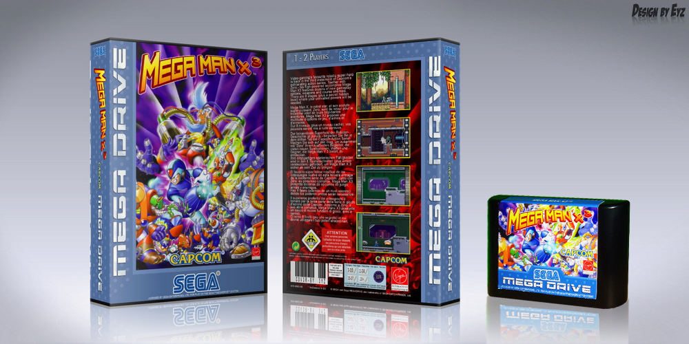
Design - Megaman X3 cartmodd custom cover art


This one was for a Megadrive cartmodd of this pirate Honk Kong-only released port of Mega Man X3.

How's the game? Well, pretty bad actually.
Ugly graphics, awful music that will make both Megadrive and Snes fans cry in agony...
Anyways, it was fun and collector enough to add to the collections :P

Please! Do not ask for these! This was a personal job, not outsourcing the work to other people. If you want me to work out something for you, I will do so for money only~

Design © Eyz 2012.
Game and work based on a propriety © Nintendo
Not for commercial use!

Tuesday, January 24, 2012

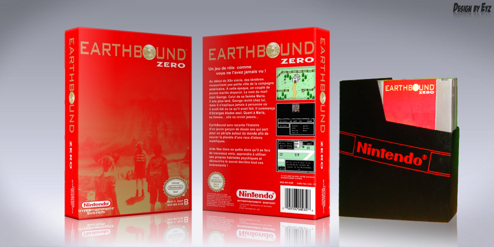
Design - Earthbound cartmodd & custom cover art

I'm going to upload some graphic design work for a change.
These are several cover arts I did for personal cartmodds.


This is a custom label & cover I designed for this Nes fan-translation cartmodd a buddy of mine did of the unreleased Mother 1/Earthbound 0 game.

Here's some more pics of it on deviantArt:

The whole package

With some info

Please! Do not ask for these! This was a personal job, not outsourcing the work to other people. If you want me to work out something for you, I will do so for money only~

Design © Eyz 2012.
Game and work based on a propriety © Nintendo
Not for commercial use!

Friday, January 20, 2012

Comics' NEWS! DC changes logo


The rumour was going on for a while, but now it is official with Warner Bros. recent new Press Release out!

DC Comics/DC Entertainment will be changing logo now, finally!
(I don't know for you, but had been a bit more logical right from the start of this "New 52" new direction 'n' all...)

The Comics Alliance takes a look at the history of the DC logo.
Now, I dunno for you, but I always found redundant to have the "comics" written below DC.
You know, with DC already meaning "Detective Comics". (Detective Comics Comics? really??)

DC, unlike Marvel, changed its logo quite a lot over the time.
The 1976's one is by far my favorite, the DC Bullet. They kept the DC Bullet for over 20 years, it is quite iconic and in fact a revised classic logo that evolved over all these years.
Now DC will be leaving the modern blue one all of sudden.

It is simply the most corporate logo I've ever seen for comics so far.
Lifeless, dull.
Don't get me wrong, it is all quite "modern" and design. But like the comics' own titles, it is too obviously designed by some random graphic designers and has no relation to the material on which it will be published on.

But the above picture was a bit generic and it is hard to have an idea on how this will look like for real.

So here's more!

The logos will actually be tuned to better represent the character(s)/family title/and genres it will represent.
It will actually look like the following just released variations:


You can already guess how they'll be used.
Either depending on the color/look of the actual covers, or in relation to the brand.
See in the first pic above the Bat-family titles' logo (top left corner), the Supes-family one (top right), the Green Lantern one, etc..
And was is the bottom left corner one on the first pic? Is that the Watchmen logo?? What will it be used for? "The Edge" books? The more indie/non-superhero books? It seems to confirm to me the return of more Watchmen material as fans feared...

DC is also giving us a look how it will look like on actual covers of issues or trade paperbacks:


Check out DC's trades new sidecorners'!

And some wallpapers, for some odd reason though featuring the original pre-New 52 characters:


Why all this, I ask you?
Why changing everything? This looks something that was forced upon DC from the higher-ups...
Well, for the digital age of medias! Of course!

This modern soulless logo is solely to better represent DC on digital apps and itunes stores and whatnot!


See how natural it looks this way?

I'd have honestly preferred they went the retro route, highly marketable as well nowadays, using the nostalgia to sell products.

At the end of the day... well DC's is a company, and a subsidiary of Warner Bros. at that!

Though, the new logo...
So bland....even worse now... this is why I dislike that companies (like DC in this case) nowadays prefer to use external graphic designers who will produce such sterile and unrelated logos for products..rather than having people on board, co-working with the guys creating the comics.

In this case, people working on the comics, making their own logo.

I already had the same problem with these New 52 series' logo...but now the DC logo follows the same pattern of "hi-tech design modern logo", and even worse, looks completely unrelated to the material. There's no synchronization or harmony between the books/cover art/content and and the series' logo or the DC ones...

(ps: Yes, I'm a graphic designer)
(ps2: yes, I can recognize graphic designers and myself included often work on our side of things, making things pleasant visually/design without thinking about a correlation, a link if you will among product and representation/logo)

And you know what, in the end there's only thing you can know for sure.... They'll change it again.

On the plus side: we'll get another one someday.
At the worst scenario: we'll be stuck with this for the next 29 years...

Update: Heck, even one of DC's artists, Greg Capullo, dislikes it! He and his wife :P

But they might change it sooner if they got some legal troubles.
You know what this logo actually looks like?....


Oh-oh...someone alert Didio and Jim Lee before this goes to print!! °__O

Friday, November 11, 2011

Drawing - "James Bond" movie poster

Today's sketch isn't a character, but rather an idea.
To make up our own James Bond 007 movie poster.
So here's mine :P


Yeah, I prefer good ol' funky vintage retro posters over silly photoshop jobs nowadays with ugly Hollywood actors mugs over it :/

Monday, January 17, 2011

The X-Men explained in a picture...

....well, not really.
They're still one heckuva complicated family.


Cable's history never looked so simple before!

Source: Joe Stone