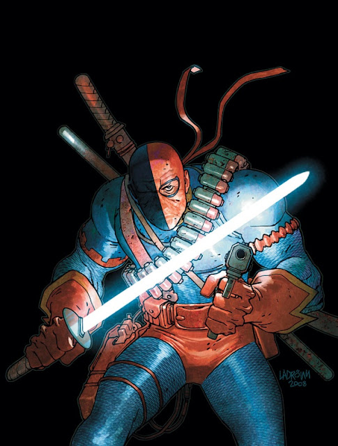
Honestly though I'm not the biggest fan of Deathstroke you'll find, but I always thought he was a decent enough villain for the Teen Titans to run into whenever. Also, I preferred when he was used over well though long over-arching story-arcs rather than on his own solo title or regular Titans villain.
I mean, he's a dangerous hit-man, do we really need to have him kill people around all the time?
Anyways, let's take a look at "Slade Wilson's" design...
[Cover from the first issue of his first regular series]
Originally, he had a pretty simple enough and iconic costumed from the go.
Blue costume, orange pirate boots and gloves, double-sided mask? It's simple, memorable and pretty visual.
(perhaps not "realistic", but this is comics, visual is always the foremost important aspect)
I like this look!
Memorable, visually original. The orange briefs might seem odd, but in a world where a red and blue-costumed flying alien is the world's most powerful hero, this is simply a logical design for a villain in it for his rep'.
[Flashpoint!Deathstroke]
Alright, so Deathstroke didn't change much over the years since his introduction. While other 80s-introduced character got more aggressive redesigns in the 2000s, Deathstroke stayed the same.
Simply because of that, he was iconic enough already!
So his first, principal and only redesign was in the giant What if/Elseworld crossover summer-event called "Flashpoint".
Embracing the whole kinda-pirate-y look altogether, this Deathstroke became a full fledged scurvy dog.
Still pretty recognisable. Kinda strange, but works in context and for the sole purpose of this alternate world.
[New 52 Deathstroke]
So when DC had Jim Lee & co redesign the whole DC pantheon, Deathstroke got his first actual in-story new look!
Like most DCnU design, it's a return to the 90s in the aesthetic.
Tons of useless details most artists besides the cover guy won't be able to keep up with, tons of lines on the costume, new gloves/suit/boots/mask based on his previous look yet altered enough to feel different.
I thinkthis is pretty representative of the whole rebooted New 52 DC Universe.
Grittier, "more serious", more badass, more attitude, more violent..
Which brings us to today.
DC announced they would cancel ~6 books already, though replacing them with as many new titles to keep the whole "52 books in The New 52" around.
Artists and writers will shuffle around.
Rob Liefeld's Hawk & Dove is canceled already (no surprise!).
So what do they do? Give Rob 3 other titles! He will write Hawkman, write orr draw Grifter (?) and will draw & write Deathstroke now!
And the above is the way Deathstroke will be even more 90s-ified under Rob Liefeld's pen.
Seems like someone won't be following Jim Lee's designs that much, heh? :P
Goodbye details, hello giant shoulderpads and pouches!
Also, Rob said his first arc would bring Deathstroke against Lobo (huh...did ya get Lobo was a parody of the whole gritty 80s/90s comics, Rob?) in spaaaaaaaaaaaaace! Because there's less details to draw in spaaaaaaaaaaace! (that is why Hawkman will also be getting in spaaaaaaaaaaace under Liefeld, like he did with Deadpool recently as well)
Final Word:


